Followers

Monday, May 21, 2012

Framed Thank You

" 'Tis better to give than to receive", but when we do receive it is simply the nice thing to do to express our thanks to the giver with a lovely card.  As today's designer for the Card A Day Blog, I have a lovely and quick card for you which can be adapted for most any sentiment.

My card is done in the standard A2 size (5 1/2 x 4 1/4).  I started with an ivory card base (inked around the edges), and used a kraft paper for the mat which I embossed with my Cuttlebug and inked lightly.  The frame was made with a two-sided designer cardstock since both sides would show after folding.

To make the frame, I started with a five inch square.  Each corner was folded to the center, and then folded back on itself to reveal the inside.  You can determine the inner dimensions of the frame by how much you fold back each corner.  In this case, the corner measures 1" from the center of the fold to the point.

I next used a piece of the same ivory for the centerpiece.  I stamped a flower for a light background, and used a scrap piece of gold card for the die cut sentiment.  You can also stamp the sentiment in a darker ink, or use embossing powder to make it stand out. Once the sentiment is taped to the center, the frame is secured with foam tape to give it just a bit of dimension.  The outer corners are secured with two-sided tape (or they can be left loose if desired).   Here is a slightly closer picture for you:


I don't have a shot of the inside of the card since it is left blank for a personal message.  As you can see, this is a card that is quite easily reproduced if you need several of the same kind. 

And here are the supply details:
          Cardstock:  K&Company 'Ancestry' and Stampin' Up Ivory
          Ink:  Memento Desert Sand and Rich Cocoa; TH Distress Ink Antique Linen
          Stamp:  Gina K. Designs 'Nature's Greetings' set
          Die:  Cuttlebug 'Thank You' by ProvoCraft
          Embossing Folder:  Cuttlebug 'Mini Floral'


Thanks so much for joining me today.  I hope to see you again very soon!

Do remember always keep your creative genius happy and well-fed!!

CHRISTINE

Wednesday, May 16, 2012

Nouveau Dad

Hi again!  I hope all you moms out there had as beautiful a Mothers' Day as I did.  And today's card, for the current theme of Fathers' Day at the Card A Day Blog, is for a first-time dad in our family.  I decided to combine the CADB theme with the current CDAC Progressive Challenge.  One of the images in this challenge is a sweet baby face from Glitterbabe, which I decided would be perfect for my card.

Since this card was being made for a man, I decided to start with a black card base (standard A2 size) and kraft cardstock for the mat.  I ran the mat through my Cuttlebug and inked it a bit to enhance the embossing.  I colored the main image with Copics and used stamps from two different sets to add some fun.  The digi image, as well as one of the stamped images, were cut with dies, and the other pieces on the front of the card were cut with decorative edged scissors.


I created my own sentiment, and inked all the pieces around the edges.  I used two sizes of foam tape to layer the different images.

For the inside, I added a kraft liner and brought in the dot pattern with a cute border stamp.  I printed my sentiment on the same white stock as the outside, cut it out with another die, and inked it as I did the outside pieces.


 I took some time deciding what to do for my card, but once I had the design in mind, creating it was really fun and easy.  I hope you have lots of fun creating cards for all the fathers in your life.

Thanks for joining me today.  Here are the details:


The dies are Spellbinders Deckled Edge Rectangles and QuicKutz Nesting Eyelet Circles.
Stamp sets used:  TCP Studio 'Baby' and 'Dots & Stripes' and Paper Studio 'Nursery Icons'


Do remember to always keep your creative genius happy and well-fed!

CHRISTINE 


Tuesday, May 1, 2012

Thoughts and Prayers

So glad you decided to visit.  I'm the designer again, today, for the Card A Day Blog, and we're starting a new month, with a new theme, and new opportunities for prizes!!  Our new theme is SYMPATHY, not usually the favorite type of card for most of us to come up with.  Personally, I like to keep them simple, and I think I've succeeded in doing that with my card.

I decided to feature one of the images from the current Crafter's Digital Art Center Progressive Challenge.  Do check them out; it's a great way to sample digi images from various designers, share your projects and have a chance to win more great prizes!  The camelia image I used here came from the Wax Fruit Company, and was just perfect for my card.


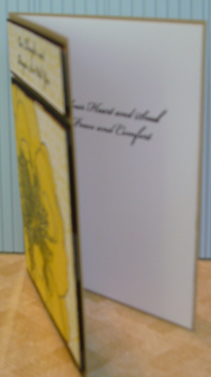
I began by coloring the image in a paint program with two shades of yellow, after checking to be sure that there actually are yellow camelias.  I printed the flower on bright white card stock, and did a little color enhancement with colored pencils.  I then over-stamped with a script stamp.  I used the same script stamp as a background for my sentiment, which was stamped in black.  Both pieces were layered on black cardstock, and mounted with foam tape to the kraft base card.  Here is a slightly closer shot:


I kept the inside of the card very simple by adding a white liner with the stamped sentiment.


As you can see, your sympathy cards can be made very simply, but still be very elegant.  Thanks for looking today.  Here are the other details:


          Stamps:  My Favorite Things 'Clearly Sentimental About Sympathy' and Clear Stamps by Kaisercraft 'Script'
          Inks:  Tim Holtz Distress by Ranger 'Mustard Seed' and Versafine 'Onyx Black'


Have a fabulous day, and keep your creative genius happy and well-fed!!!


CHRISTINE


Tuesday, April 17, 2012

2012 GRAD

Hi everyone!!  As today's designer at the Card A Day Blog I have another fun, and fairly quick, graduation card to show you.  I used my Cricut and the Cricut Craft Room online design software to make this one, but you can certainly make something very similar using scissors, paper punches or stickers. 

The card base was cut at 9" X 7 1/2" with the finished card fitting into a #10 business envelope (9 1/2" x 4").  The white liner was cut at 9" X 7 1/4" and inserted to leave a bottom border.  The letters of the two words were welded, and then cut at 1 5/8" (real dial size off).


As you can see in the photo, the graduate's colors are purple and gold.  I chose a vibrant purple for the letters, a softer lilac for the base card and a pretty gold ribbon behind the letters. The ribbon was wrapped to the inside before attaching the liner so the ends are covered nicely. This card is for a young man, so I wanted to give it a masculine look.....no bows, no flowers.....you know the drill.  I decided to use white numbers (with just a bit of glitter) to coordinate with the white liner.  The words were applied with foam tape to give dimension.

Here's the full front view:


I'm really happy with the way this card turned out.  I hope you like it, too.  Here is the short list of supplies:

          Paper:  words-Core'dinations, card base-Basis by Leader Paper Products, liner-Wassau
          Ribbon:  The Ribbon Boutique (JoAnn's, I think)
          Cricut Cartridges:  words-Blackletter, card and liner-George and Basic Shapes plus Elegant Edges
          Numbers:  Thickers 'Delight' from American Crafts
          Adhesive:  Tombow Mono, generic foam tape

And that's it!!

Over at CADB we have challenges running all month long based on our themes for that month.  Please join us; we always give prizes!!!

See you again soon, and remember, always keep your creative genius happy and well-fed.

CHRISTINE

Monday, April 9, 2012

Here's to Grandmom

Hi everyone!  I do hope you and your family enjoyed a beautiful Easter celebration.  Our Easter service was so joyful, and filled with glorious music.  I'm here, today, to bring you a Mother's Day inspiration for the Card A Day Blog.  I really enjoyed making this card, using images from one of the Crafter's Digital Art Center Progressive Challenges.  The girl in the image reminds me of my daughter, so I decided to make this card for her to give to her grandmother.  Here's the first peek:


The girl is a digi image from Back To Paper.  I colored her with copics, and paper-pieced her dress using a matching blue marker to color the trim.  The flowers are another digi, this time from Glitterbabe.  I printed the flower in the yellow paper in three sizes and cut them out for dimension.  The stems are just cut from a scrap.

The card stock I used is a nice weight, and I wasn't expecting the color to bleed through, but it did!  Since I needed to cover the bleed on the inside, I printed the sentiment directly onto a matching blue card stock and used it as a liner.


And a closer view so you can see the fonts used:


Of course, I had to get daughter's approval every step of the way.  She chose the outside sentiment, which comes from Sarah Hamer of 'My Pink Cricut.'  Here is the full front view:


As you can see, I rounded the corners.  I cut the liner just a bit smaller and rounded those corners to match.  And of course Grandmom needs a little bling, so rhinestones were added to the flowers.

I hope you enjoyed your visit today!  Think about joining the CADB challenges.  Please do remember to keep your creative genius happy and well-fed!!

CHRISTINE

Monday, March 19, 2012

SPRING HAS SPRUNG!!! Blog Hop

Spring Has Sprung!
The designers at Card a Day Blog are joining together to do a Blog Hop! The theme is dimensional cards!


To join in....visit all the participating designers by visiting their sites, some are having prize giveaways...so make sure you pop in!
Make sure you comment on all the blogs too, because at the end of the blog hop, they are going to send a list of all who commented on their blog,
and we are going to do a grand prize drawing of all comments on each blog!
The grand prize is your choice of a pdf pattern book, valued up to $20, from http://popupcards.com/shop-patterns.html !
Make sure to check back at Card a Day Blog March 23rd, to see who won!

So JOIN IN TODAY....comment on the main blog page, and visit the other hop pages and comment there too!


And now for the reveal of my creation for the hop!  One of the first things that comes to my mind when I start seeing the signs of Spring is Easter.  I'm generally thinking of the religious aspect, but for this hop I decided to go for the cute, more casual side of the holiday.  I've been wanting to use some supplies that I picked up several months ago, and this hop, with the requirement of something dimensional, was the perfect opportunity.

My card started with a purple 8 1/2" x 5 1/2" base, which folds to a standard A2 size, and a nice bright white mat.  From there I began my stamping.  As happens so often with me most of my card was made with scraps.  I needed to stamp an Easter egg, and found a nice scrap of design paper with pastel flowers.  I also unearthed the perfect yellow scraps for the chicks that I was stamping.  Then, as luck would have it, I found a nice die cut srip of grass that turned into the ideal foundation for an egg hunt.


I really love the stamps in this set by INKY ANTICS. After determining where the grass would be, I stamped a some of the three different little eggs to look hidden in the grass.  I didn't want too much ink to show on the floral dp so, for the large egg, I used a light green that would blend somewhat.  The chick was stamped with a coordinating color, and then cut out.  I enhanced the beak and feet with marker.  The other tiny eggs were placed to look as though the chick tossed them up in the air to land where the children would find them in the grass. Here's a view from another angle:


You can see that I added a bit of dimension by curving the egg in just a bit and mounting it with foam tape.  I also curved the chick's wings out and mounted her, also with foam tape, to look as though she's sitting on the egg.


From this angle you might be able to see that the edge of the card has a bit of thickness folded into it.  This was done to accommodate the surprise inside. In this case the surprise is a nice bright pink Easter egg made with the Honey POP Collection Honeycomb Paper.  For those of you who may not be familiar with this paper, it's made especially for Inky Antics to be used with the stamp sets they've designed for it.  Here is the inside of my card with your surprise:


 And a couple of closer shots to show the coloring and the inside sentiment:


 In the last pic, especially, you can see the score lines for the fold.  The Honeycomb Paper is quite thick and needs this extra space, although the folded card remains fairly flat for mailing.

I hope you've enjoyed this little stop in your hop.  Since this post is already so long I've eliminated the list of supplies, but you can check below in the labels, and if you have any questions feel free to leave them in a comment.  I will try to get back to you quickly.

Keep that creative genius of yours happy and well-fed!!!

Hugs and Happy Spring Wishes!
CHRISTINE


Okay, here is the list of all the CADB hop participants.  Remember to leave a comment for all the designers so you'll have more prize entries!!  (It's short, and shouldn't take you too long.)     


Friday, March 16, 2012

Congratulations Graduate!

It's my turn, once again, to bring you some inspiration from the Card A Day Blog.  Hello friends and welcome newcomers to my little creative space.  This week's theme at CADB is 'Congratulations.'  We have a graduation coming up before too long, so I decided to use that as my inspiration for this card.  I didn't have to think about what colors to use because the school colors are purple and gold...one item taken care of; just needed to find the papers.

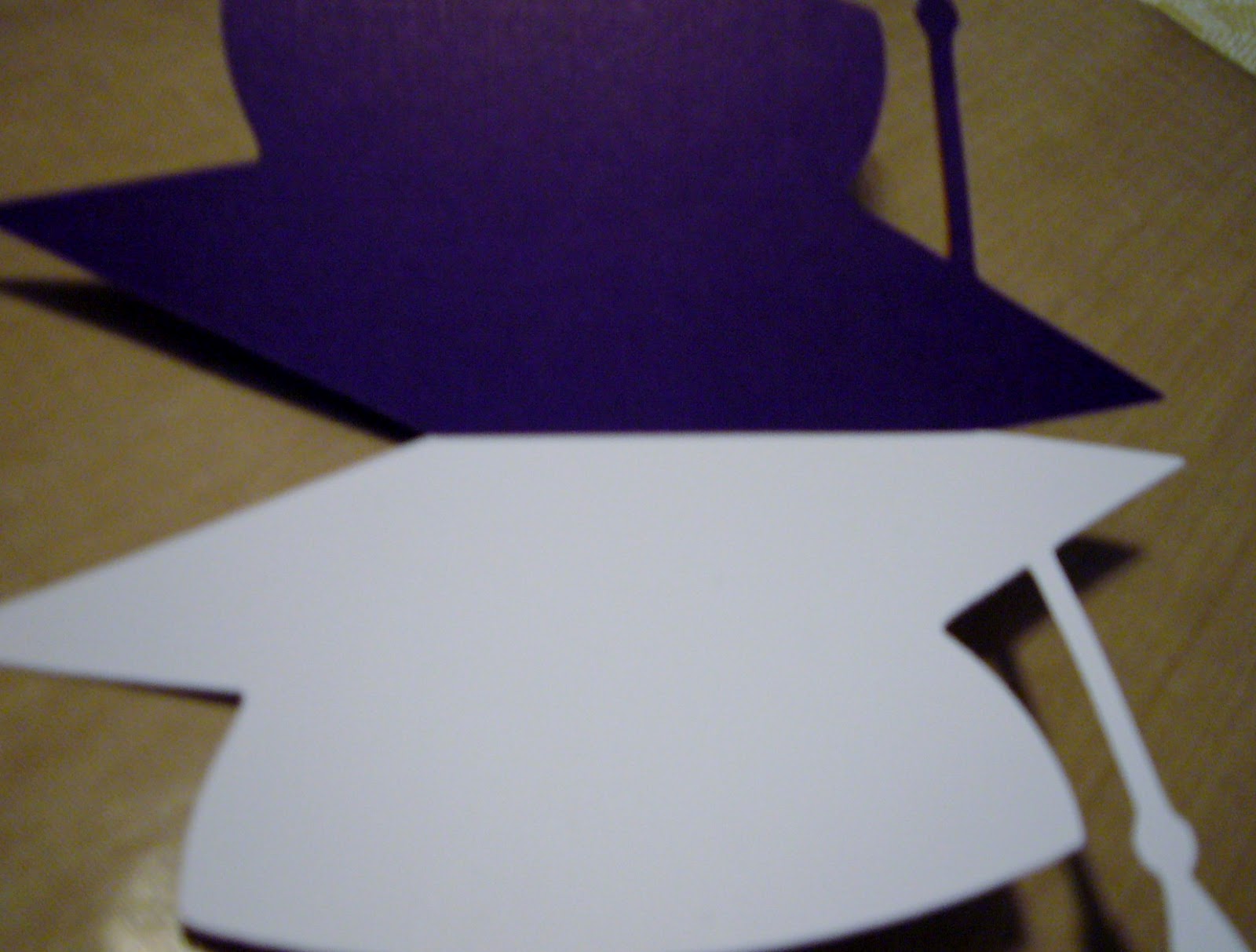
I knew I would be using a Cricut cut, and I had to do a bit of hunting to find what I needed.  Here are the pieces before assembly:


As you can see, I decided to use the mortarboard for a shaped card.  The one I used comes from the Cricut cartridge "Wrap It Up."  The next photos show the back of the card where you can see the fold where the front and back are attached, and also the inside where the front is folded back.


An angled shot shows the bit of dimension added by attaching the sentiment with foam tape.


I used VersaMark and Detail Gold embossing powder for the stamp.  Here's a nice close-up:


Finally, here is the full front view:


This card was really quite easy to make once I got the pieces sized on my Gypsy.  Here are the rest of the details on supplies:

          Papers:  Core'dinations (both purples); Stampin 'Up Whisper White and More Mustard
          Stamp:  Close to My Heart "Frames, Tags, Borders" set
          Die:  Spellbinders Circle
          Embossing Powders:  Stampendous Detail Gold
          Glues:  Tombow Mono Glue Stick and Mono Dots


Be sure to stop by on Monday, March 19, for the Card A Day Blog SPRING HAS SPRUNG Blog Hop.  There will be PRIZES!!

Thanks for visiting, and remember always keep your creative genius happy and well-fed!

CHRISTINE

Wednesday, March 7, 2012

Little Star

My goodness, I've missed you!  Guess I've been away too long, but I'm so very glad you've decided to visit today.  I have another design for you from the Card A Day Blog.  If you're visiting for the first time, welcome.  I hope you'll stay awhile to see what I've been doing, and that you'll decide to become a follower.  We have a fun blog hop coming up soon on CADB, and, of course, there'll be prizes!!  So do stay tuned for that.  (Little hint:  MARCH 19th)

Our theme this week at CADB is BABY, and I have a cute and very simple card to show you. My card is all in pink for a sweet little girl, but it can be easily adapted for a boy.

I have quite a collection of Spellbinders (and other) dies, and I wanted to make use of some I had not used as yet.  I chose the Shapeabilities Lace Doily Motifs and Lace Doily Accents.  I must admit that with all the tiny cuts in these intricate dies I had some difficulty getting the larger of my pieces out of the die.  But once I managed to get it out I was pleased with the result. 

My first photo shows the main feature of the card, which is a cute onesie, as it is mounted on the layered die cuts which frame it.


The larger die cut needed to be inked to cut down on the brightness of the card stock.  I used Tim Holtz by Ranger "Antique Linen" Distress Ink.

I chose a cute matching sticker for the sentiment.


Both stickers are from the Brenda Walton "Small Wonders Girl" collection by K & Company.  These sets include really adorable embossed stickers with lovely soft colors and just a bit of glitter.  The onesie is from the "Icon" collection, and the sentiment is from "Words."

Here is the full view of the card:


The base card is Bazill Basics "Peony Pink."  It is a top-fold A2 sized card.  The other papers are Stampin' Up "Very Vanilla" and Best Occasions "Bright Punch-Out Pack" from Walmart.

I hope this has been a good inspiration showing that you can make a card with lots of impact using very few materials and not too much time.

Thanks for stopping by, and remember.....

always keep your creative genius happy and well-fed!

CHRISTINE

Monday, February 13, 2012

The Wearin' o' the Green

Top o' the mornin' lovely ones!!  (or afternoon or evening or whenever you're catching this)  I'm the designated designer today over at the Card A Day Blog, and we're celebrating a week of St. Patrick's Day greetings.  So go get your green goodies and some shamrocks, and come join in our celebration.  It might just be your lucky card that wins our challenge this month!

Now for my card.  I've been wanting to use some of the great digi designs I've been accumulating, and I knew there had to be something appropriate for the theme this week.  After a bit of searching, I found the perfect designs; I hope you'll agree.  The design is fairly simple, but I think it comes across with great effect.

I didn't want to reduce the size of my central image too much, so I decided on a base size of 6" X 4 1/2".  The image would have a double frame, and then a greeting banner would be added.  Here are the first photos:


I printed the image (yes, it was already colored), and designed my own greeting.  I chose a font that closely resembled the sentiment digi I would be using on the inside.  I also chose a digi image of a bunch of shamrocks for the inside of the card.


Here's a closer shot.  I did the coloring on these myself.  I used Distress Inks for these images as well as the front frames.


Finally, here is the pic of the full front of my card.  I used foam tape to mount the frame and the greeting.


Now for the little details:
     Card Stock:  Recollections (for base and inner frame), Stampin' Up Very Vanilla (for all printed images)
     Design Paper:  K&Company
     Ink:  Tim Holtz Distress Ink by Ranger (Antique Linen and Bundled Sage)
     Digi Images:  Front image from Paper Crafting World, Inside sentiment by Meljen's Designs, Shamrock Bunch from Waltzingmouse Stamps
     Dies:  Spellbinders Labels Seventeen
     Markers:  Copic, Micron Pigma
     Misc:  Fiskars Paper Edgers - Victorian

Time to shake the green and get back to the red to wish you a very

Happy Valentine's Day!!!

With lots of hugs,
CHRISTINE

Tuesday, January 31, 2012

Feel Better

Hello, my friends!  Over at the Card A Day Blog we are still in 'Get Well' mode.  So I have another card for you in that theme, and I was still in the mood for paper folding, so I have another Iris Fold design to show you.

My card started with a scrap (yes, big surprise there, I know!) that was leftover from a die cut.  I saw the piece sticking out of my scrap envelope and thought it would be a great frame for an iris fold square.  I wanted to use some happy, sunshiny Spring colors, and took out one of my Iris Folding Papers booklets that had the right kind of papers.  I printed off the size square I needed, and went to work.


I did some inking around the edge of the piece as well as the edge of the paper, and then decided to find my card base.  Because of the size of the scrap, my card needed to be a 5 3/4" square.  I found a piece of Stampin' Up cardstock that was a perfect match.  I wanted the base to have a bit of texture, which I accomplished on my scoring board.  I affixed the central image and added a flourish at the top:


and a sentiment at the bottom.


In keeping with the basic simplicity of the front, I added a very simple sentiment to the inside with some inking at the corners along with a few score lines for texture


Here is your full front view of today's card:


If you haven't visited us at the Card A Day Blog, please stop by sometime.  We bring you a new card inspiration every day from one of our many talented designers, with new themes nearly every week.  If you like challenges, we have those as well, of course including prizes!!

Added to:  Pink Cricut 'What Are You Up To?'
Thanks so much for coming to see me today.  Hope you have a moment  to leave a comment!

Remember, always keep your creative genius happy and well-fed!

CHRISTINE

Monday, January 23, 2012

To Brighten Your Day.....

Right now there are so many people around us who are sneezing and sniffling and feeling just plain rotten.  Those seasonal colds and flus are in full force giving us good reason to reduce our stashes (and make room for new goodies) by creating lots of Get Well cards.  That's our theme this week at the Card A Day Blog. 

The card I have for you today was made primarily using Stampin' Up products.  It actually started life as an event project that I didn't have time to make at the event.  I made some changes to the original design to transform it into a nice get-well wish.  Here's the first pic:


This card is one of many variations on the step-fold.  Starting with a piece of  'More Mustard' card stock 8 1/2" X 5 1/2", scores are made 1" from the top and bottom of the card at 1", 2" and 5 1/2" from the edge, and between 1" and 4 1/4" at 4 1/4" from the edge.  The 1", 4 1/4" and 5 1/2" folds are mountain and the 2" is a valley fold.  Here is an angled view of the card:


The main element is cut from Bigz die set 'Beautiful Butterflies.' It's stamped in Memento 'Rich Cocoa' with a Memories Direct border stamp, inked with VersaMagic 'Sea Breeze' and adorned with pearls colored to match with Copic BG32.  The butterfly is foam mounted on a 'Very Vanilla' mat embossed with Textured Impressions 'Square Lattice' folder and backed by 'Chocolate Chip.'  To the sides are pieces of design paper (sorry, don't have the name) inked with the 'Sea Breeze' to give them a bit more depth.


The inside of the card features the same dp on a mat with the stamped sentiment and a sweet stamped butterfly.


Both sentiments are from Hero Arts 'CL342.'  The butterfly stamps are from Inkadinkado.  Here's one last pic of the full front:


If you've been one of the many victims of the seasonal bugs, I hope you're feeling much better very soon!  Thanks for coming by to visit.

Always keep your creative genius happy and well-fed!!

CHRISTINE


Tuesday, January 17, 2012

A proper Thank You is golden!

Hello, and thank you for joining me today!  At Card A Day Blog this week, we are featuring cards for all those special people who are so deserving of our thanks.  I've been wanting to make a card using tea bag folding, and, as luck would have it, I received a book on just that subject as a Christmas gift.  The book is TEA BAG FOLDING by Janet Wilson and Tiny van der Plas, and, in addition to basic instructions,  it has several beautiful projects as well as papers you can use to make them.

I started out by reading through the instructions for the different projects.  Then I cut some scrap paper so I could do a few practice folds.  I chose the design paper I wanted, cut out the pieces I needed, and proceeded to fold the necessary elements.  With the centerpiece prepared, I needed to determine what other supplies I would use to finish the card.

I had a sizable scrap of a pretty shiny gold paper, and decided to layer that with a white mat on a black card base.  I centered the main element, then cut the corners from one more square to add to the design.  I used the same gold paper for the sentiment which was heat embossed with detail gold powder.  The finishing touch became a little bit of bling.

Here's a nice close shot to show you the dimension of the folds:


Did you see the rhinestone peeking out from the center?


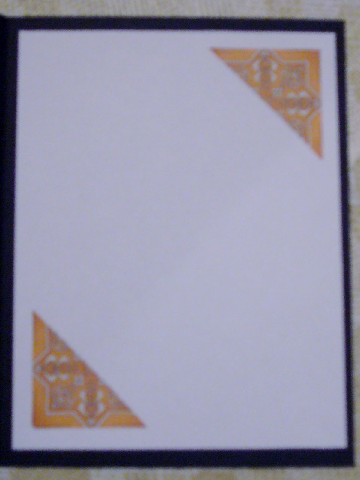
I really love the tone-on-tone of the sentiment.  And here is a photo of the inside.  I cut the remaining part of the extra square in half to bring the design to the inside.


Tea bag fold designs can lend such elegance to your projects. There are lots of resources online where you can find designs for folding as well as free papers. You do need to cut and fold carefully to be sure the pieces fit together well, but I highly recommend giving it a try.


Always keep your creative genius happy and well-fed!

CHRISTINE

Thursday, January 12, 2012

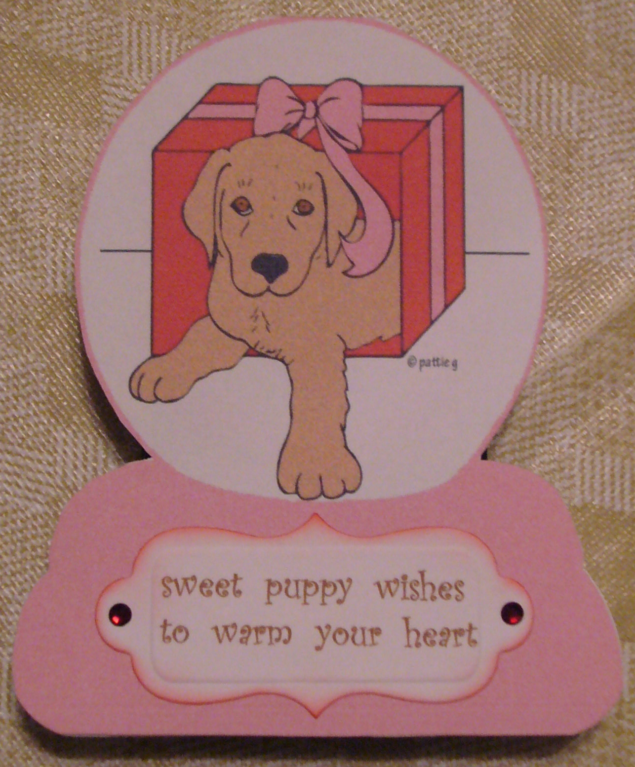
It's Puppy Love!

The current Crafter's Digital Art Center Progressive Challenge has such cute images for us to play with.  We are on cdacpc9, and it's for members only, but there is a way to join while it's in progress.  So go on over to the CDAC website and check it out.

I couldn't resist Crafty Ann's snowglobe, and Pattie's Creations gave us an adorable puppy in a gift box.  I created one card for pc9, but I actually played around with the artwork until I figured out how to combine the two images.  I am so pleased that I was able to add this skill to my repertoire.  I'm sure I'll be using it regularly.  I was able to put the puppy image inside the snowglobe, color it in the software, and print it out so that I could cut it with a fold at the top. { I love shaped cards! }  I used two different Spellbinders shapes for the inside and outside sentiments which I created in Word.  A little inking and some rhinestones for a bit of sparkle, and it's done!

Here are the photos for you:


I hope you like my cute little puppy snowglobe.  Please leave a comment to tell me what you think, and thanks for stopping by!


And always keep your creative genius happy and well-fed!!

CHRISTINE