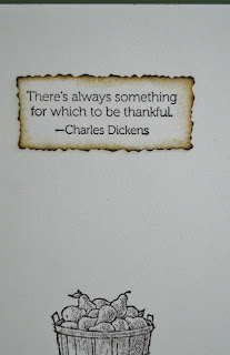
...for which to be thankful." - Charles Dickens
Well said, Mr. Dickens. And, this week, the Card A Day Blog is featuring Thanksgiving as our creative inspiration for you. My card happens to be a card I made last year (I think) which never made it into my blog. Of course I had every intention of making a brand new card for you, but time truly got away from me. I know we all understand how that can happen sometimes.
This card was made entirely from Stampin' Up products in the standard A2 size. The image piece and insert were cut from Very Vanilla, but I don't remember the names of the other paper colors. The mat was cut at 5 1/4" x 4" and finished with a decorative corner punch, and the image and it's mat were cut at approximately 3 5/8" x 2 3/8" with the image piece just slightly smaller. The center image is affixed with foam tape. Here is the front of the card:
The inside sentiment (our quote from Mr. Dickens) was stamped on the Very Vanilla, cut out with a Spellbinders Deckled Edge Rectangle, inked around the edges and affixed. The inside image was stamped just for a little extra 'something.' The first photo came out a bit blurred, but here it is anyway so you can see the spacing.:
Here is a nice clear shot of the inside sentiment:
That's about it for now. Thanks for coming to visit. I'll be back soon to show you a few things I've been working on with some Girl Scouts!
Big Hugs,
CHRISTINE
This blog was created for the display and exchange of craft ideas and information, especially on cardmaking, but also including such lovely activities as scrapbooking, knitting, crocheting and sewing.
Followers
Monday, October 22, 2012
Sunday, October 7, 2012
Chickadee and Holly
Greetings! I hope everyone had a fun time browsing lots of cardmaking blogs yesterday to celebrate World Cardmaking Day. There is so much talent out there, isn't there!?! I have a card for you today to open a week of Christmas and Animals at the Card A Day Blog. From my title you probably guessed the central images on my card. Here's your first look:
I used a set from Stampin' Up called 'Beautiful Season.' I wanted to keep the card fairly simple because it is one of a set of cards I designed for some Girl Scouts to reproduce in a series of workshops. So the image of the Chickadee in the Holly Branch was stamped with no added coloring, but just a little inking around the edges for a slightly aged look.
In the next photo you can see the sentiment and a close-up of the banner piece which was embossed using a Cuttlebug folder in a design that echoes the holly of the central image.
The banner, as well as the card base and the design papers were inked a bit just like the main image piece. The inside of the card was left very clean, with only the sentiment stamped.
I love this sentiment. I think it can be used for many styles of Christmas and other holiday season cards.
In the last photo you can see the full front, with a good look at the design papers I used. I think it's a good-looking card, but still easy enough to make for inexperienced young card-makers.
Just for the sake of clarification, the red is simply background; it's not part of the card. (In case you were wondering.) This card fits a standard A2 sized envelope.
Hope you like today's little card. Here are (most of) the details:
Papers: Stampin' Up, K and Company
Inks: Memento 'Rich Cocoa', Tim Holtz Distress 'Antique Linen'
Stamps: Stampin' Up set 'Beautiful Season'
Corner Punch: Tonic
Embossing Folder: Cuttlebug 'Holly Ribbon'
Thanks for visiting!! See you again soon.
Big Hugs,
CHRISTINE
Subscribe to:
Comments (Atom)


